Showing posts with label scrapbook pages. Show all posts

Tuesday, May 7, 2013

layout for fun!

I haven't been making too many layouts lately, and certainly not just for fun, but made this one! I got these new Webster's Pages papers and couldn't resist making a page with them. 

Almost everything on this page is webster's pages except the mist, which is clearsnap, and the sequins. 


Saturday, May 4, 2013

Clearsnap NSD Blog Hop!


Today I want to share this fun layout that I created about my daughter's first performance of the Nutcracker Ballet. I used Clearsnap Crafter's Ink all over this layout - on the fabric, on the letters and on vellum! Crafter's Ink is so versatile!


For the stamped fabric, I used an old repositionable adhesive mat from an electronic die cut machine and placed the fabric flat on that. It held it still so I could stamp perfectly! Then I removed the fabric from the mat, put a scrap sheet of paper over top and ironed it to heat set the ink. 


The vellum was suprisingly easy! I just stamped the image. (Stamp gently and be careful not to move the stamp at all because it tends to want to slide on the slick surface of the vellum.) Then I heat set the ink with my heat gun. 

I didn't have the letters for the full title in all the same color of letters, so I inked them up liberally with the crafter's ink and heat embossed them with the Opalescent Clear embossing powder to make them all match with a beautiful shimmer!

Not only is that technique great for stretching your chipboard alphabets, but it made my letters match the layout perfectly since I used the same ink as the stamped fabric and accents!


Supplies:
Top Boss Embossing Powder in Opalescent Clear

Graphic 45 Patterned paper
Hero Arts stamp
Bella Blvd alphas
Bazzill cardstock
Want2Scrap jewels

Other: white fabric, sewing machine and thread, vellum


Wednesday, February 13, 2013

My Mind's Eye Sketch challenge

I just got some of the new MME lines and couldn't wait to use them! This sketch challenge seemed like the perfect opportunity! Here is the sketch...

And here is my layout featuring mostly the brand new My Girl line. I love the bright colors of this line! The chicken wire background was created with a Crafter's workshop stencil and some clearsnap stephanie barnard dye ink spray


Saturday, November 10, 2012

My Little Shoebox and Vintage Shop

Today I want to share with you some projects that I created last month for the My Little Shoebox blog. I worked with the Vintage shop line to create this altered birdhouse. This line is sweet and pretty and so much fun to work with!


I also created this layout, using the Vintage Shop papers and the matching Unity stamps. I embossed the stamps with clearsnap embossing powder. For the background I used a crafter's workshop plastic template and misted over it.


Thanks for looking! Be sure to check out more details on my post at the My Little Shoebox blog.


Monday, November 5, 2012

My Little Shoebox and Epiphany Crafts!

This week My Little Shoebox and Epiphany crafts are teaming up and I can't wait for you to see the inspiration we have to share! I have been quite curious about the products at Epiphany and I have to say that they did NOT disappoint!

I received a shape studio star tool and got right to work using it! I was worried that it would be difficult to get the epoxy part directly onto the spot that I wanted, but it totally wasn't! I am a stickler for things being perfectly straight and lined up just right and this tool delivered!

Here's the layout that I created with the epiphany star tool and the Oh Deer! line from My Little Shoebox.


Thanks for stopping by! Check out the My Little Shoebox blog for more inspiration! And also don't forget to stop by the Epiphany Crafts blog!


Monday, October 22, 2012

My Little Shoebox and Want 2 Scrap


My Little Shoebox has teamed up with Want 2 Scrap to bring you some inspiration all this week with the collaboration of My Little Shoebox collections and products from Want 2 Scrap.

I’m so excited to share this scrapbook page that I created with the My Little Shoebox Vintage Shop line and some Want to Scrap chipboard and swirls.
I used a sketch from Northridge Publishing.Underneath the photo I created a bunch of layered banners using the My Little Shoebox die cuts and some Want to scrap chipboard. I covered the chipboard with patterned paper and sanded the edges to make it match the distressed edges of the die cuts. I also covered the chipboard pieces with glossy accents to make them stand out just a little bit more. 

The date piece is also Want 2 Scrap chipboard that I covered in patterned paper. The pearl swirls are also from Want 2 Scrap. The stickers, die cuts, papers and alpha stickers are all from MLS. For the pink part of the title, I lightly stuck the letters down, traced them and peeled the stickers back up.


I hope you enjoy the my project and the others that are featured today. We’re also offering a chance for you to win some My Little Shoebox goodies for yourself.

The Prize:
My Little Shoebox is giving away a complete two collection kits today.

To win:
Leave a unique comment on each blog featured today. The winners will be chosen randomly from all comments on the My Little Shoebox blog AND the designer blogs. Make sure you also stop by the Want 2 Scrap Facebook Page and tell them My Little Shoexbox sent you.


Here is a list of today’s My Little Shoebox designers that are featured:
Megan <---- That's me!

Make sure you check them out and comment to win! Also, come back to the My Little Shoebox blog all this week for more chances to win and more inspiration from My Little Shoebox and Want 2 Scrap.

Wednesday, September 19, 2012

Webster's Pages challenge layout

I have been playing with mixed media lately and created this page for the webster's pages august trends challenge.


Most of this page is Webster's Pages girl land. For the background I used a crafter's workshop template and applied some modeling paste, then let it dry. After it was dry I put the mask back and lightly went over the design with some lilac Clearsnap ink. I also misted the background for more dimension with some Clearsnap smooch spritz and some Tattered angels glimmer mist.

Wednesday, September 5, 2012

Clearsnap Double page smooch spritz layout

I made this double page layout for the Clearsnap blog. You can see more details and a full tutorial over there. I wanted this layout to be as bright, fun and artsy as my daughter!


Monday, August 27, 2012

My Little Shoebox Aiko layouts

Here are a few layouts that I created for My Little Shoebox featuring the Aiko line. I feel like I am always saying the same thing about my My Little Shoebox projects, but that's because it's true! I had so much fun working with this line. I created three very different pages, one pink and girly, one bright and spunky and one blue and playful. You can see more details about these layouts on the My Little Shoebox blog.


Thursday, August 9, 2012

My Little Shoebox Double Layout

I think I forgot to share this one. This is a page that I created for My Little Shoebox with the fabulous Up in the Trees line. You can see more details of this layout on the My Little Shoebox blog.


Monday, June 18, 2012

Twinery and My Little Shoebox Blog Hop!


+


What a great combination! I was so excited to work with the Twinery for this hop! I adore their twines and use them on almost everything. I admit that I often use just a little bit here and there though, hoarding them. It was fun to have an excuse to break out my twines and really USE them! 

I created this double page layout using the My Little Shoebox Keepsake line and a ton of twine! It looks like a lot of work, and I guess it was a little time consuming but I had a great time weaving the twine to create the background on the sides of the page.


I used my crop-a-dile to cut notches at half inch intervals, then I strung the twine between them, securing on the back. Here are some closeups.


Here's the lineup for today:


Megan Aaron  <---------- You Are Here


Be sure to come back tomorrow and the rest of the week for more inspiration!

Friday, June 15, 2012

Clearsnap Trinity Blog Hop!

Welcome to the Clearsnap and Trinity Paper Arts Blog Hop!! Our Design Teams have "teamed up" to share layouts, projects, and more featuring Trinity Paper Arts' paper collections and Clearsnap's distinctive inks and accessories. From sports to summer and everything in between, kick your sandals off, grab a cold lemonade and enjoy the inspiration.   Hop along to each blog listed below and leave a comment.

http://clearsnap.blogspot.com
http://trinitypaper.blogspot.com
http://tamisanders.com/
http://taylordconcepts.blogspot.com/
http://thoughtsoftraveling.blogspot.com/ <----- YOU ARE HERE
http://stitchcutcreate.blogspot.com/
http://www.arteypoemas.com/
http://www.kitsnbits.blogspot.com/
http://inmyblueroom.blogspot.com/
http://www.rukristin.blogspot.com/
http://sabrinaalery.blogspot.com/
http://www.jaxbeanstalks.blogspot.com/
http://www.hydrangeahippo.com/
http://scrapbookingischeaperthantherapy.blogspot.com/
http://whatsinalousyananut.blogspot.com/
http://blueyecicle.blogspot.com/
http://www.twotearsinmybucket.blogspot.com/
http://faerieenchantment.blogspot.com/

Each comment is an entry into a drawing to win the entire Trinity Paper Arts' "Surf N Swim" Collection!


PLUS, a second winner will receive Smooch Spritz in Gingersnap, Designer Foils in Blue, and Design Adhesives!

For extra entries, post about this blog hop to Facebook, Twitter or your blog! Just leave a comment on either company blog telling us what you did and each comment will count as your extra entry. And now, let's heat up the summer!!
The Trinity Paper arts 'Sincerely' line is perfect for this romantic photo of my Mother and Father-in-law on their anniversary. I used the Rollograph stamp wheel with grey ink on the Respectful Ledger A to create a subtle written effect on the lined paper. A hint of smooch accent on the stamens of the flowers, that I hand cut from the  Bouquet A, makes them pop. I also used a design adhesive with gold foil to draw the eye in towards the photo and sentiment. I also inked the edges of pretty much everything with one of my trusty Cat Eye ink pads to mimic the distressing on the papers.

Supplies: Clearsnap: Cat Eye ink in black, Smooch ink in Illuminate, Design Adhesives and foil in gold, Jumbo Rollograph and stamp wheel in Wordswords with Ancient Page ink cartridge in Flannel Grey.
Trinity: Sincerely: Noteworthy A, Bouquet A, Dots B, Decor Stickers and Alpha Stickers.

Monday, June 4, 2012

We ARE the Wildlife layout with Joy's Life stamps

This week Joy asked us to create scrapbook pages this week, I was pretty excited. We just got back from a week long trip to Savannah. (Which is why my blog has been a little slow lately - I have SO much to share!)

I chose the 
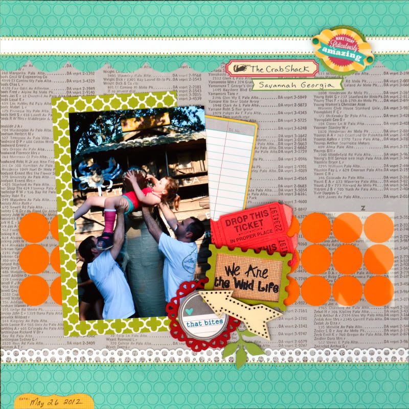
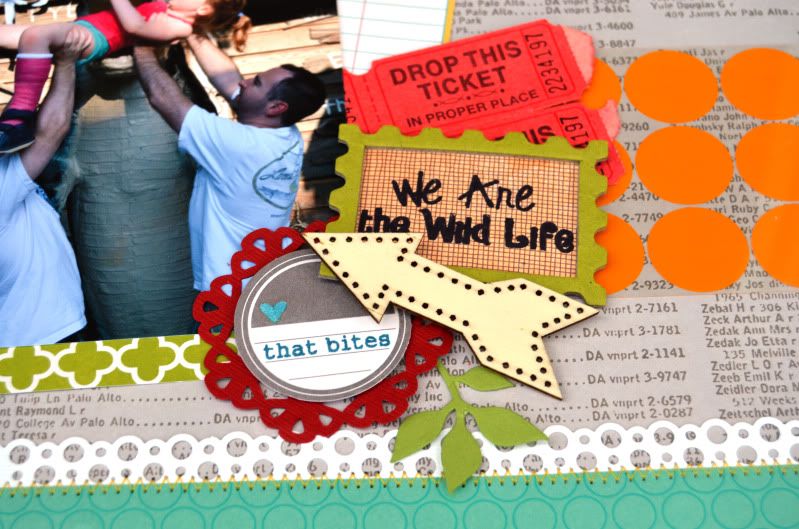
'We ARE the Wild Life' stamp from the Wild Life Puns set because I thought it fit this photo to a 'T'. The story behind this photo - which I guess I should probably add to this page in the form of some journaling - is that we were waiting to be seated at a VERY popular restaurant, the Crab Shack on Tybee Island in Georgia outside of Savannah. They had a sort of 'gator' theme since there was a pond of alligators that you could feed. I guess because there are always so many people standing around waiting, there were a bunch of places for photo ops. This giant alligator statue was one of them. We took a couple of normal photos, then my husband and brother-in-law thought it would be fun to 'feed' Ellie to the gator. She thought it was a good idea too, until she got up there. Then she started yelling at them to put her down, which they did, but not before I snapped this photo. It makes me laugh because here they are doing something that could be construed as a little stupid, with a kid who is in a cast and crying. I was thinking that all the people standing around were probably thinking - 'uh, no wonder that kid is in a cast!' LOL.

(By the way, the cast had nothing to do with stupidity on anyone's part except hers. She climbed up on something in gymnastics and when the teacher told her to get down, she jumped and landed badly in bare feet, breaking a tiny bone on the top of her foot - the night before our trip, which just happened to also be my birthday. Yeah, fun times.)

Anyway, so this photo makes me laugh, but rest assured no children are actually being harmed in this photo.

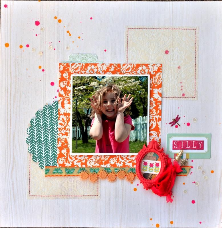
I used a combination of Jillibean soup (Neopolitan Bisque) and Hambly for this page. The teal paper and the orange circle transparency are Hambly, the other papers, stickers and die cuts are Jillibean soup. The wooden arrow is Pink Paislee. The postage frame is Maya Road. The tickets are from a Hydrangea Hippo kit. The Ink is clearsnap. and of course, the stamps are Joy's Life. Cardstock is Bazzill. Die is Sizzix.
On the title, I sprayed the paper with a little bit of glimmer mist to mute the pattern before stamping the title in Stephanie Barnard dye ink in Kettle. I also found the 'that bites' stamp on the Joy's Life Sweet Popsicle Puns set and thought that would be fun as a subtitle. I used Stephanie Barnard dye ink in cornflower on that.  I colored the heart in with a little bit of smooch in ocean.


Sunday, March 4, 2012

Pagemaps sketch layout for Webster's Pages

You know I love Webster's Pages, and I also love Pagemaps. So I just HAD to do this layout for a chance to win the new Sunday picnic collection from Webster's Pages.
I used some Bella Blvd and We R Memory Keepers papers and embellishments along with a studio calico wood frame. The stamped leaves are unity stamps and I used a technique with a transparency to get the mirror image of the stamp. Stamp on the transparency then turn it upside down and place it where you want it then rub like a rubon. 


Tuesday, November 22, 2011

A couple of fun little toots


This week this from my Scrapdango October reveal, featuring Little Yellow Bicycle Hello Fall, and some Jillibean Soup accents, is featured as the Facebook Profile pic over at Creating Keepsakes Facebook page.
Also, I don't think I ever shared these pages that I created a couple months ago. They were published in Scrapbook News and Review, so I couldn't share them. But now I can! These feature the Happy Camper collection from Imaginisce. These pictures are from our camping trip to Assateague Island. That reminds me, I never scrapped the photos of the wild horses. Will have to add that to my to-do list!

Wednesday, November 2, 2011

Another Balance tutorial Layout that was Soup Spotted!

This is a page that I created for the ACOT balance tutorial - showing radial balance. I used Jillibean Soup Sweet and Sour soup (LOVE this collection) and it was featured on the Jillibean Soup blog today as part of soup spotting!

Tuesday, September 20, 2011

Guest Designer post at Clearsnap


I have another post up on the Clearsnap blog today. This time I made a scrapbook page using some fun products and techniques. Here is the page, pop on over to the clearsnap blog to find out how I made the yellow diamond background and the ruffled muslin border!


Wednesday, September 7, 2011

September 4x4 is here!

The four products we used this month were Simple Stories' Hello Sunshine paper, Cosmo Cricket Scraps Paper, My Mind's Eye Soar Twine, and Webster's Pages Let's Celebrate Designer Threads.

This month Carrie is hosting - so be sure to hop over to her blog and check out all of the fabulous creations side by side. Jess and Chrissy played along this month also.

Here are “The Rules”:
We must use the same four products: two papers and two embellishments.
- We can only use one of each sheet of paper.
- We can use unlimited basics (card stock, ribbon, alphas, mists, etc.) as long as the four main products are the focus.
- We cannot share our finished pages with each other until we are all done so that we do not influence each others’ design choices.


This is my page for the 4x4


Monday, August 15, 2011

August Scrapdango Reveal


This month I worked with the Sugar kit, which included some gorgeous papers from Authentique along with some beautiful Primas and other embellishments. This kit was so much fun! The papers are a great quality - thick with a subtle almost watercolor paper texture, and of course double sided and gorgeous!

I started by thinking of what photos would work well with these papers. Since I tend to be pretty much up to date, I was looking at a lot of beach and pool pictures, that I didn't think would really work. So I started looking back and found that I had not scrapped easter and passover, and they are perfect for these colors!

Here are a couple of my creations:

I almost always start with the double page layout, that way I make sure that I have the duplicate papers from the kit available for use. Originally I was going to make the photos go in a straight line across the page. See how the tall photos are the same height as the two smaller ones put together? that was the plan put them all in a row. but then I couldnt figure out where to put my title... I like this arrangement more - it has more interest. You can't tell from this photo, but I used some glossy accents and a sprinkle of glitter on strategic spots of the floral circle, the tiny flower embellishments on the title and the 'leaves' of the prima flowers.

For this page I was just having fun. I wanted to try something different with the border. I ALWAYS have to have a border and it seems to usually be a solid quarter inch border and/or stitching. This one is different.


To see the rest of my creations check out the Scrapdango forums, and my reveal thread HERE.