My Little Shoebox has teamed up with Want 2 Scrap to bring you some
inspiration all this week with the
collaboration of My Little Shoebox collections and products from Want 2 Scrap.
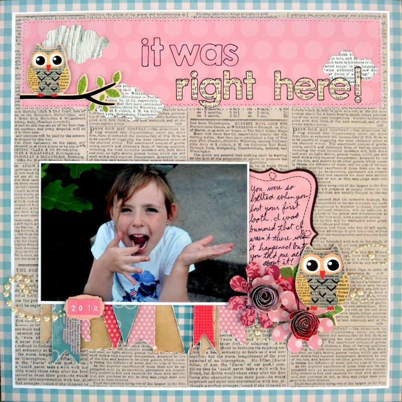
I’m so excited to share this scrapbook page that I created with the My Little Shoebox Vintage Shop line and some Want to Scrap chipboard and swirls.
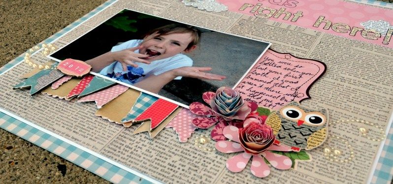
I used a sketch from Northridge Publishing.Underneath the photo I created a bunch of layered banners using the My Little Shoebox die cuts and some Want to scrap chipboard. I covered the chipboard with patterned paper and sanded the edges to make it match the distressed edges of the die cuts. I also covered the chipboard pieces with glossy accents to make them stand out just a little bit more.
The date piece is also Want 2 Scrap chipboard that I covered in patterned paper. The pearl swirls are also from Want 2 Scrap. The stickers, die cuts, papers and alpha stickers are all from MLS. For the pink part of the title, I lightly stuck the letters down, traced them and peeled the stickers back up.
I hope you enjoy
the my project and the others that are featured today. We’re also offering a chance
for you to win some My Little Shoebox goodies for yourself.
The Prize:
My Little Shoebox is
giving away a complete two collection kits today.
To win:
Leave a unique comment
on each blog featured today. The winners will be chosen randomly from
all comments on the My Little Shoebox blog AND the designer blogs. Make sure you also stop by the Want 2 Scrap
Facebook Page and tell them My Little Shoexbox sent you.
Here is a list of today’s My Little Shoebox designers that are featured:
Megan <---- That's me!
Make sure you check them out and comment to win! Also, come back to the My Little Shoebox blog all this week for more chances to win and more inspiration from My Little Shoebox and Want 2 Scrap.









14 comments:
Cute layout! We're getting to the losing teeth stage. I love all the print on this text paper on this layout - on the stamped images/embellishments, alphas, really fun!
Love how you used the printed paper! Those owls are adorable! Really like your banner too!
I love the background paper. My favorite part is the owls.
What a darling page!
So sweet! The newsprint paper looks amazing and I love the cute banner!
This is SO absolutely adorable!!!
Wonderful layout--I like the banners and the cute owls.
Nice photo=)
I like the banner and different papers you used.
Great layout, love the design! Cute photo! My son just lost his first tooth in an apple orchard, not sure if it fell on the ground or if he swallowed it while eating an apple. I was pretty bummed to not have that first tiny tooth!
love the banners and what a great idea to scrap those memories... my baby is 20 and miss those missed photo ops the most
Such a darling photo of your girl. Love all the attention to detail you put into your layout. Thanks for sharing!
I love how you punched out the letters in the title so we can see the background paper underneath!
Such a cute layout and a great picture!
Carol B
ciaoitalia2007(at)gmail(dot)com
A Lovely Layout! I like how you layered all the banners and I just adore the owl!
Post a Comment